Fake News - articles designed to get you to click, regardless of whether they are truthful or not!
Recently, I did a blog entry on understanding statistics. I opined that a lot of journalists don't understand statistics, or intentionally misrepresent data in order to sell eyeballs:
Similarly, how charts are prepared can make trends look more alarming than they are. A chart that shows a stock price skyrocketing doesn't show the scale (or does in small numbers). It is only when you realize the Y-axis begins at $20 and has a spread of ten cents, and the X-axis is showing a timeline of the last ten minutes, that you realize the "big spike in share price!" is nothing more than statistical noise.
As if the peoiple at CNBC read my blog, a journalist puts together a deceptive article that seems to neatly illustrate my point.
Alarmist title? Check!
Misleading Data? Check!
Graph with Y-axis not at zero? Check!
Missing X-axis labels? Check!
It covers all the bases. In this case, the misleading title is that "nearly half of all Americans are unemployed" which is deceptive, as it talks about the employment rate not the unemployment rate which are two different things. Yes, your 93-year-old grandmother in the nursing home is "unemployed" but that is not counted in unemployment statistics as she is not looking for a job just yet. It also includes me, as I am retired. Similarly, your 8-year-old nephew doesn't hold down a job. Slacker! Young people these days - I swear!
The data is then skewed to show this alarming title is "true" technically. But what it fails to make clear, unless you really look at the numbers is that even in the best of times, only about 60% of the population in the United States is gainfully "employed" at a job. Housewives don't count. College students don't count. Retired people, institutionalized people, children, people in jail - they all don't count.
So they resort to using a tricky graph which seems to show employment falling off the face of the earth - plummeting to nearly nothing! But of course, the graph zeros out on the y-axis at 52.5%, making the change seem more alarming. Blow up any chart large enough and even the most trivial change seems dramatic.
Is the whole thing a lie? Well, no, not technically, but does the author of this piece sleep well at night, thinking he is following a long line of illustrious journalists? I hope not, because this "reporting" is just crap.
Yes, it is true that unemployment is up because of the virus. A lot of people are not seeking work, however, because their unemployment check is larger than their paycheck was, with the "stimulus" check being a nice bonus. But it is not a rise to 30% unemployment as in the Great Depression, and hardly 50% as the article implies. The latter is a baldfaced lie, and you know what I say about liars - the relationship ain't gonna get better. You can pretty much write-off anything published by CNBC at this point, if they vet an article like this as suitable for publication.
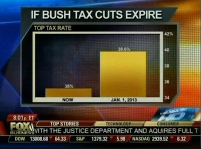
I mean, we expect this behavior from Fox News. But CNBC? For shame!
The journalists who wrote this dreck should be ashamed of themselves. But I doubt they are - they are laughing all the way to the bank! Selling out their fellow man - and their country - for a few bucks. How pathetically sad.


